Stop Stalking Us is working to change society’s perception of stalking while providing essential resources to survivors and telling the stories of those who have experienced it firsthand. With their goals clear, they turned to Funkhaus to help define their brand. Through positioning exercises, we helped their team clearly define their mission, values, and history through the written word, crafting copy that asserts their expertise with the seriousness that stalking deserves. Coupled with a new distinctive design scheme, they now have a strong, substantive visual identity that lends a cool factor to a deeply sensitive cause.
Stop Stalking Us
A mission-driven identity for a conversation-changing non-profit

Stop Stalking Us A mission-driven identity for a conversation-changing non-profit
Brand Identity
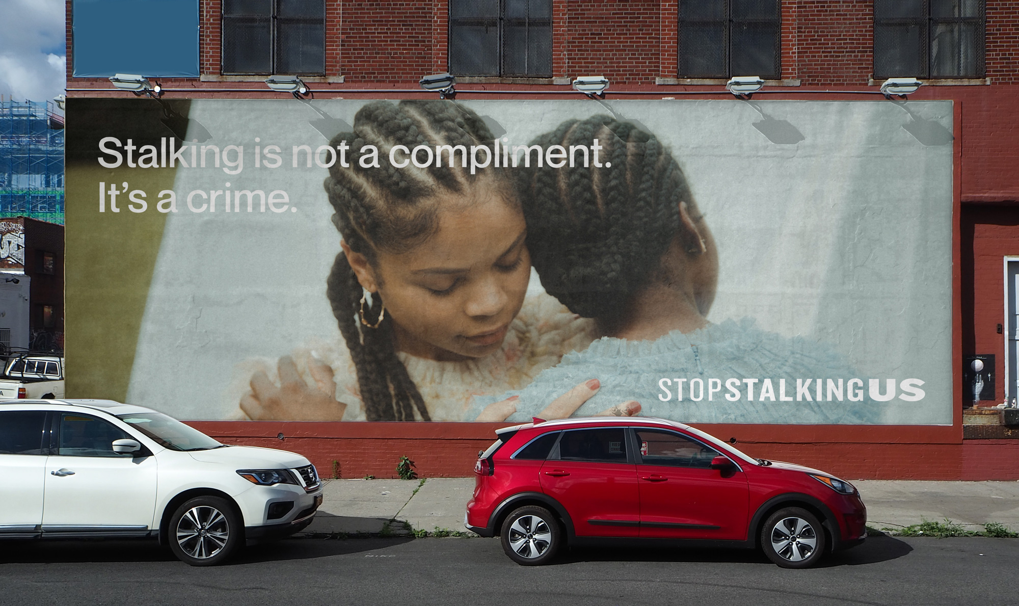
Striking visual storytelling that preserves anonymity
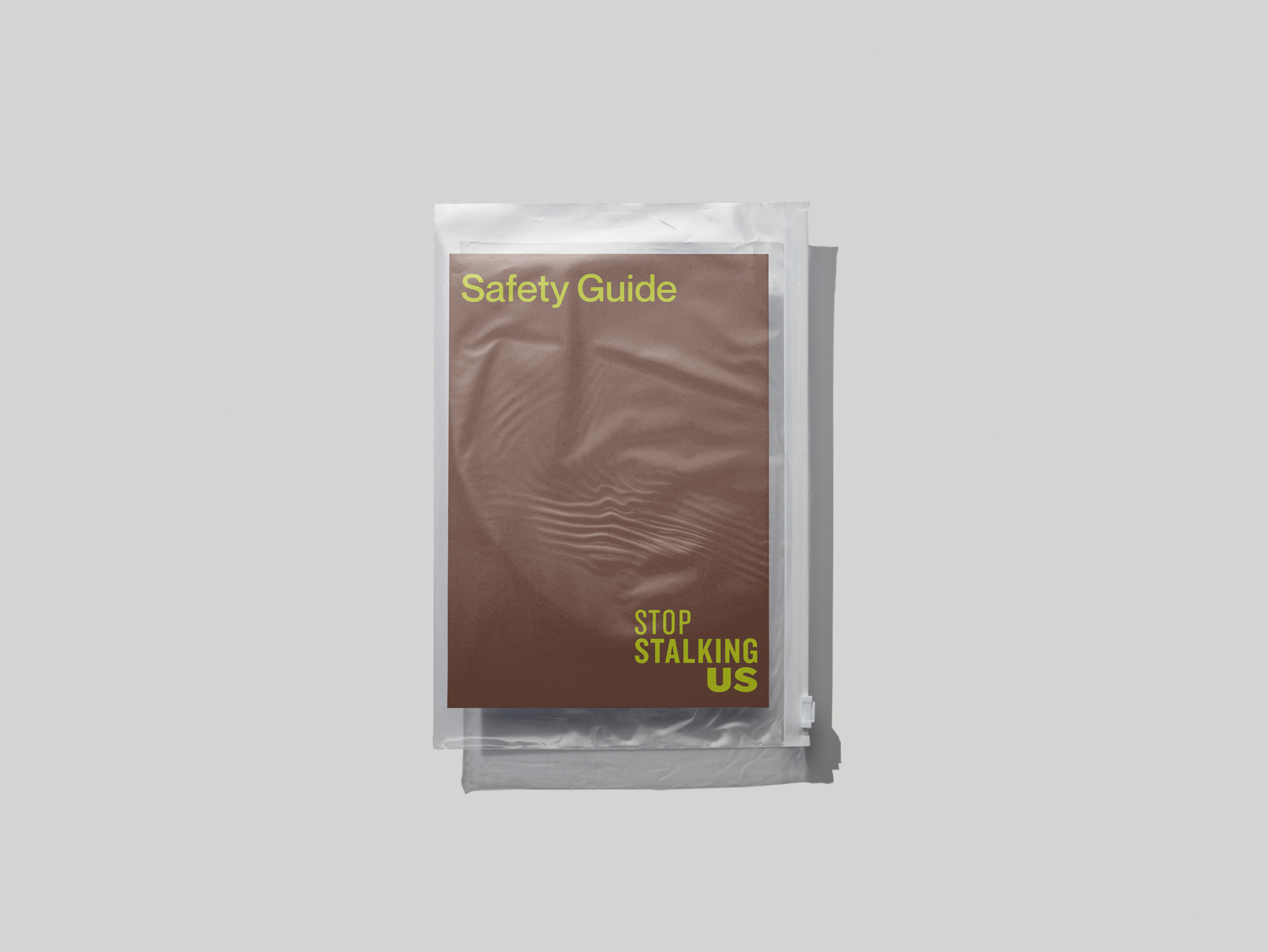
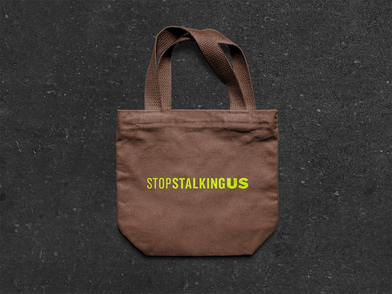
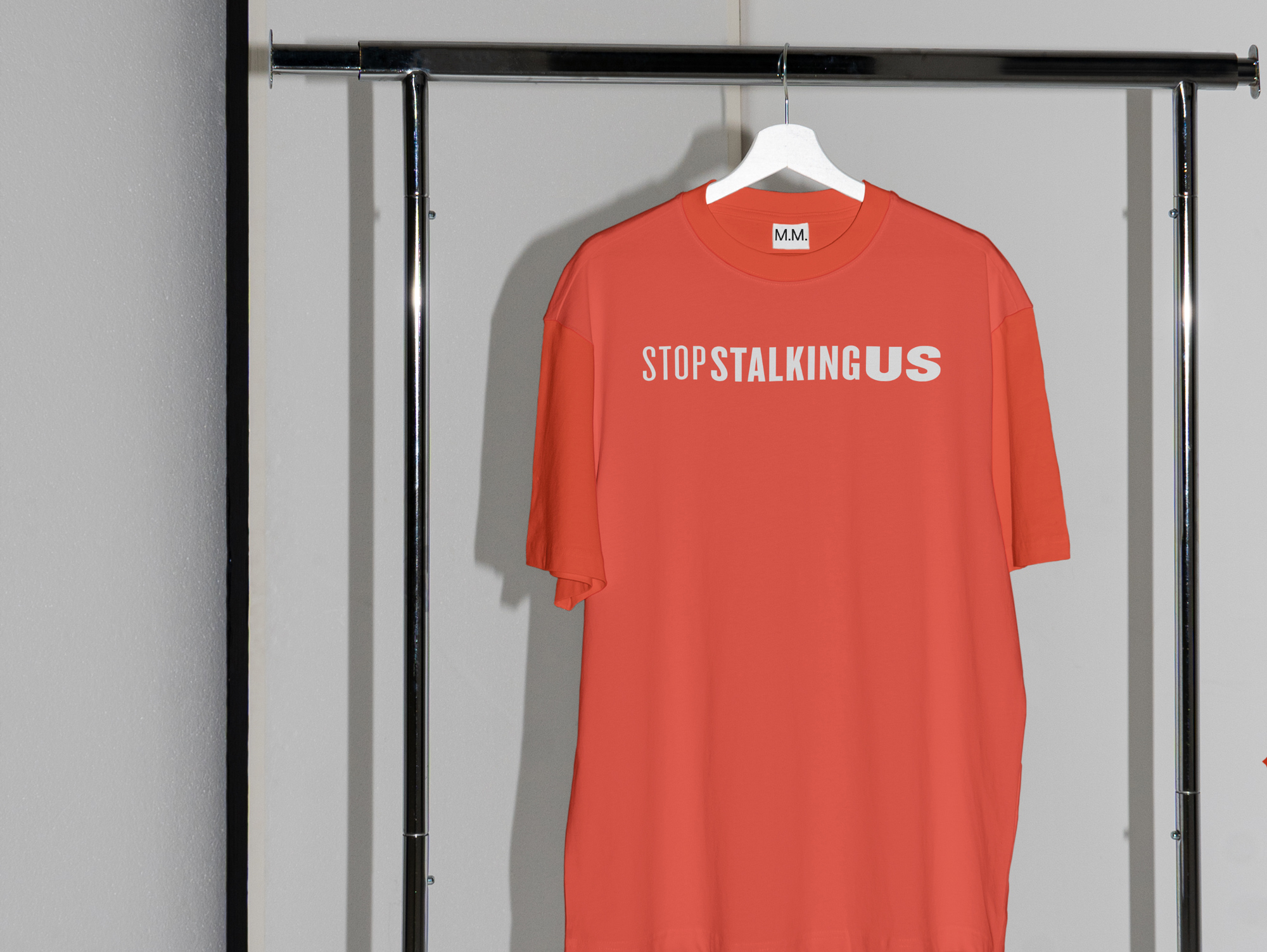
To complete their new visual identity, we designed a polished, type-driven logomark that catches the viewer’s eye while communicating a sense of trust, protection, and support. Our selection of typeface was essential, as the name itself was doing the heavy lifting — once we chose a unifying type, we mixed multiple font weights together to put the emphasis on certain words and to make their statements even more powerful. We selected a striking color palette and created logo and typography usage guidelines, giving them flexibility and offering versatility while also future-proofing their brand.
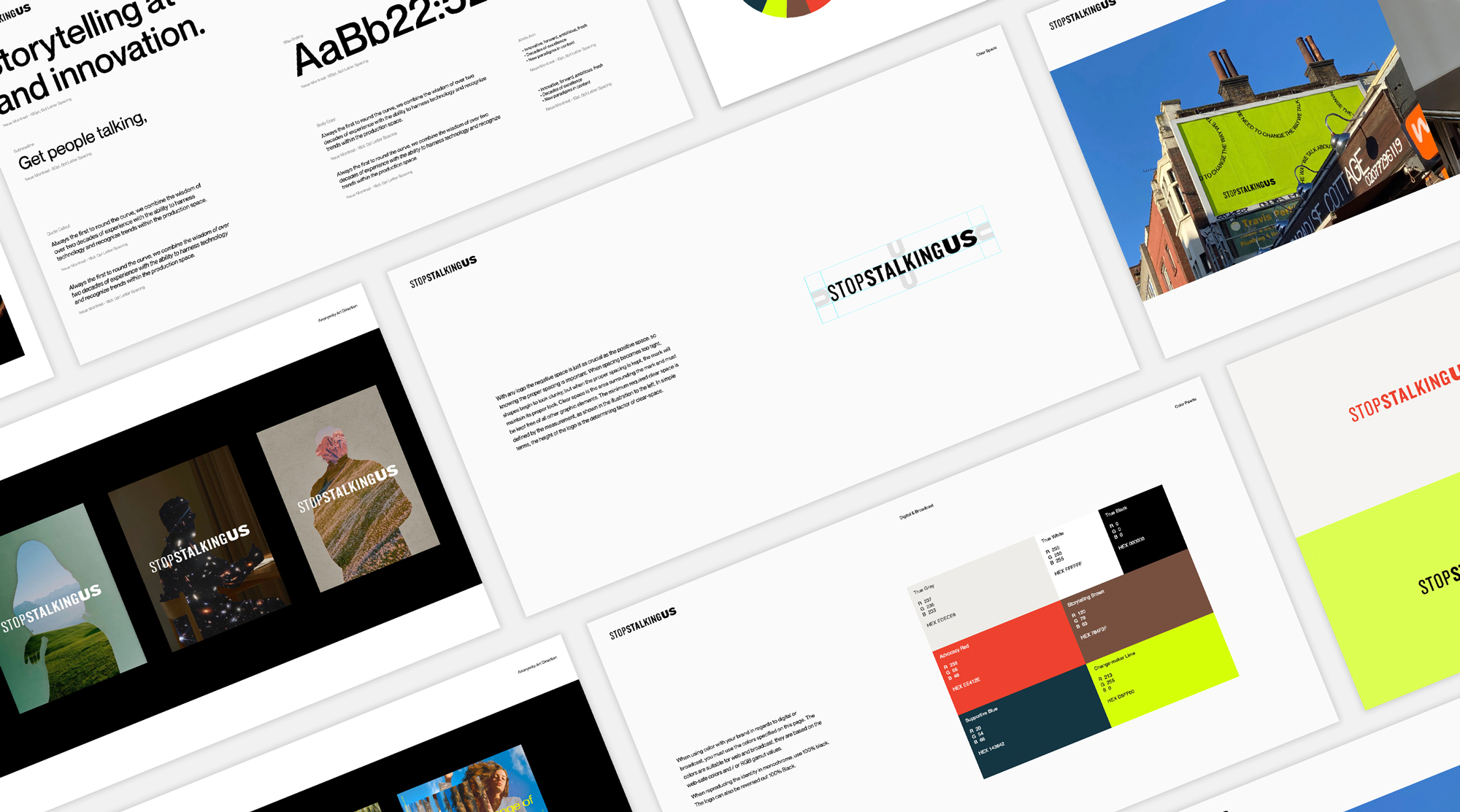
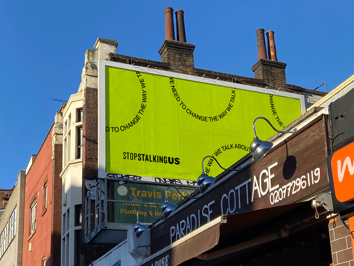
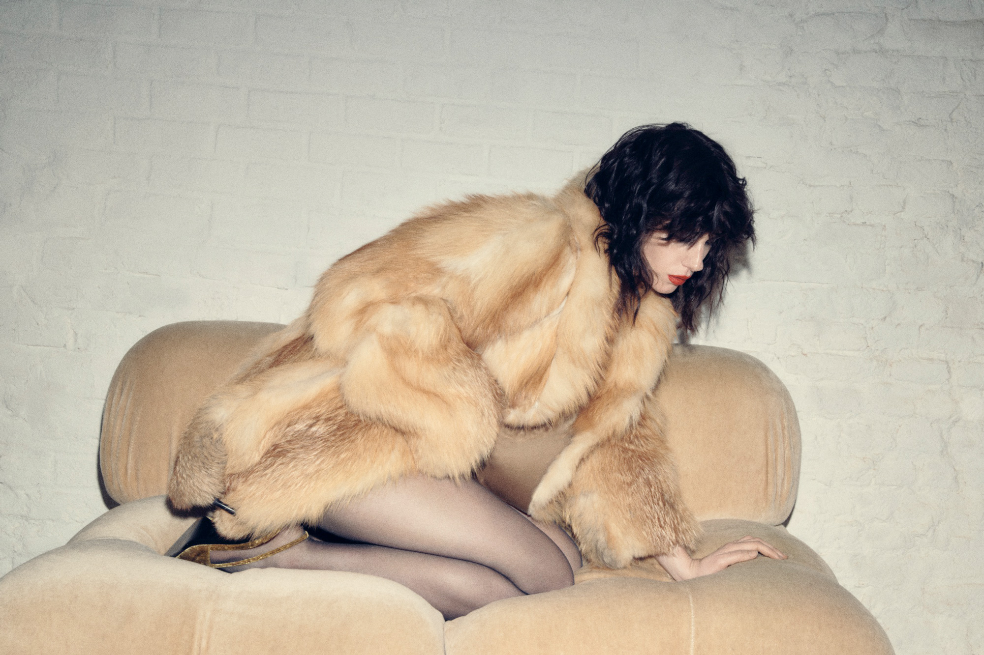
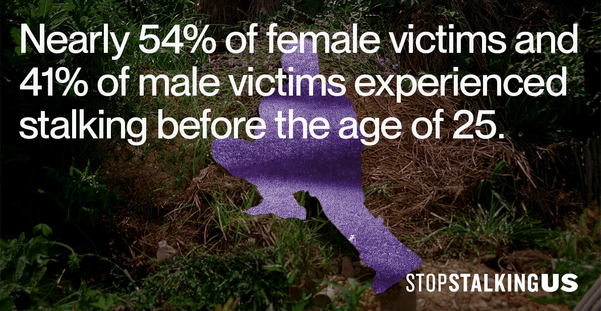
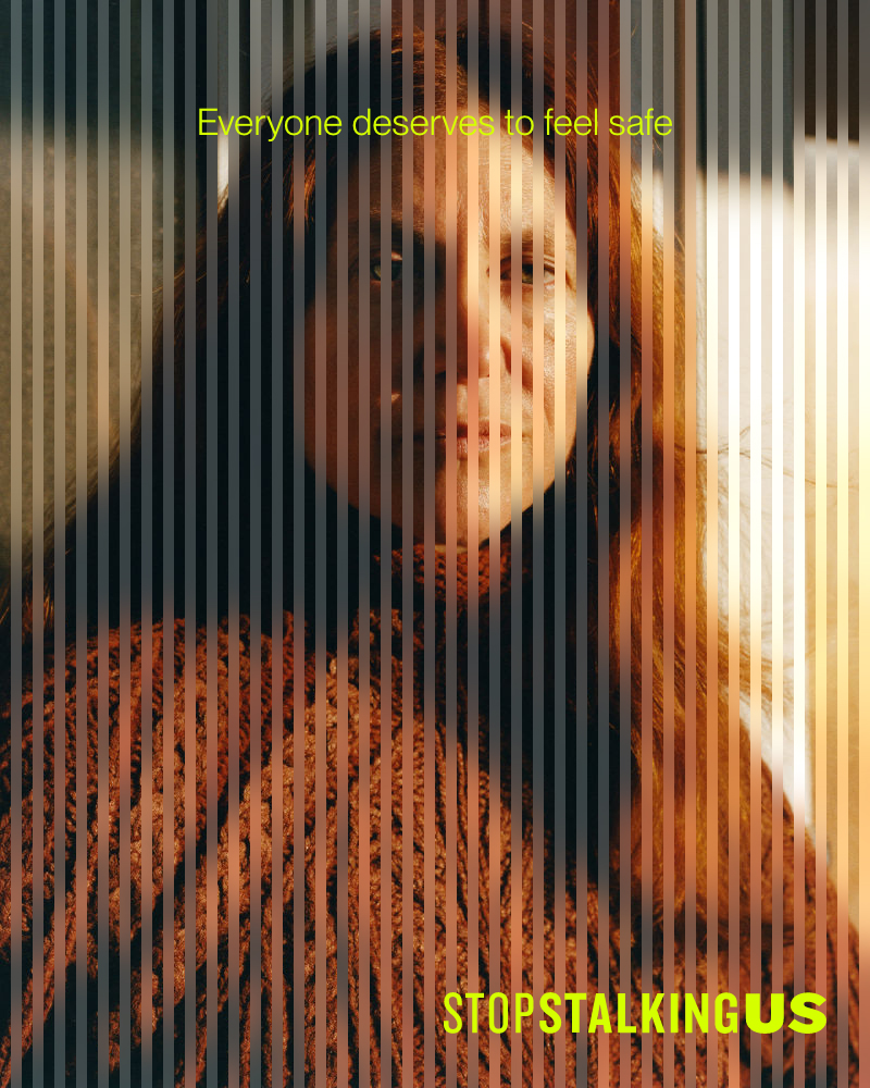
Storytelling is central to the mission of Stop Stalking Us, but many in their community cannot safely show their faces. To accommodate this need, we crafted an art direction that protects the anonymity of its subjects, using creative design elements like cutouts and textured glass effects to obscure identity while retaining a sense of humanity. Always maintaining a sense of thoughtfulness to ensure a strong, consistent aesthetic, we leveraged visual interest to attract people to the brand, and in turn promote awareness and action.
Brand Positioning
Cool and confident language for a cause
With a new logo, SSU needed new language and positioning to match — words that would help them distinguish stalking as a critical issue that is different from other forms of violence, approach change through first person stories with a reverence for anonymity, and reiterate to victims that SSU offers safety and support without judgment.
With these goals in mind, we developed brand copy, a mission statement, and a series of brand anthems for use across web and social to communicate the SSU story to a wider audience. We made sure to not only keep language tight and succinct, but also maintain a sense of cool, in line with the visual elements of the brand.