Quintessential California eyewear brand Garrett Leight approached us to re-capture the spirit of their brand that is so palpable in their physical stores in their digital presence. To do so, we created a website that brings that sense of human connection and established personality online, showcases their expertise and high quality product, and guides users through a top-tier optical shopping experience.
Garrett Leight
A stylish Shopify re-platform for an eyewear brand that embodies California cool

Garrett Leight A stylish Shopify re-platform for an eyewear brand that embodies California cool
Strategy
Auditing an existing digital presence for an improved user experience
We began by conducting a complete audit of their legacy website, where we carefully analyzed design flows, UI and UX, and their data. Out of that exercise, we compiled a comprehensive discovery document that reflected what we observed during our audit and offered recommendations for improvement based on industry standards and competitive peers.

We recommended a full, ground-up rework of their site, which we determined should include a digital merging of all brands under the banner of Garrett Leight, including GLCO, their original line, and Mr. Leight, their high end line of premium Japanese-made eyewear.
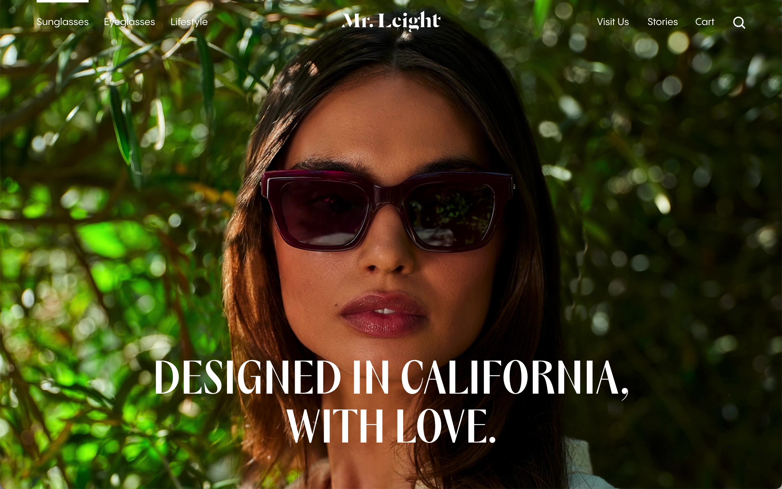
At the outset, the two brands lived on separate websites and Mr. Leight redirected users to Garrett Leight to buy their styles, which we felt was a non-ideal presentation of both brand value and shopability. Within a new framework, these brands can live together while telling their own stories, with a focus on the quality of craft and the product itself.
Digital
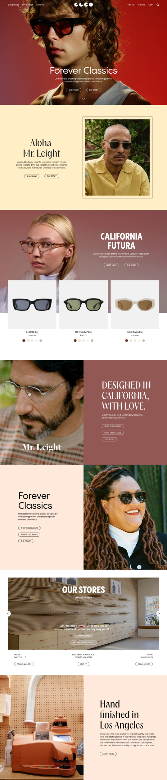
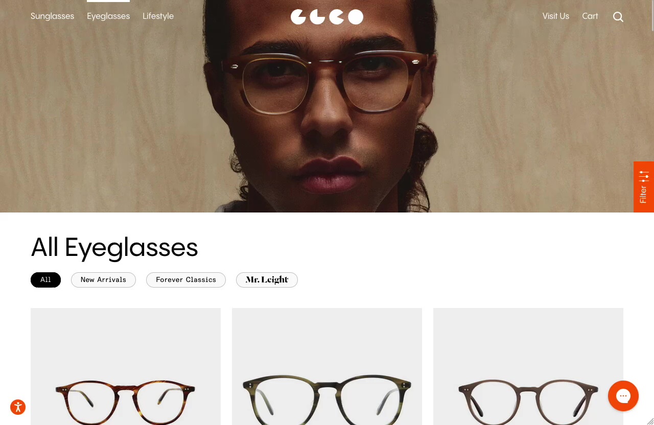
Modern, vibrant design that puts products front and center
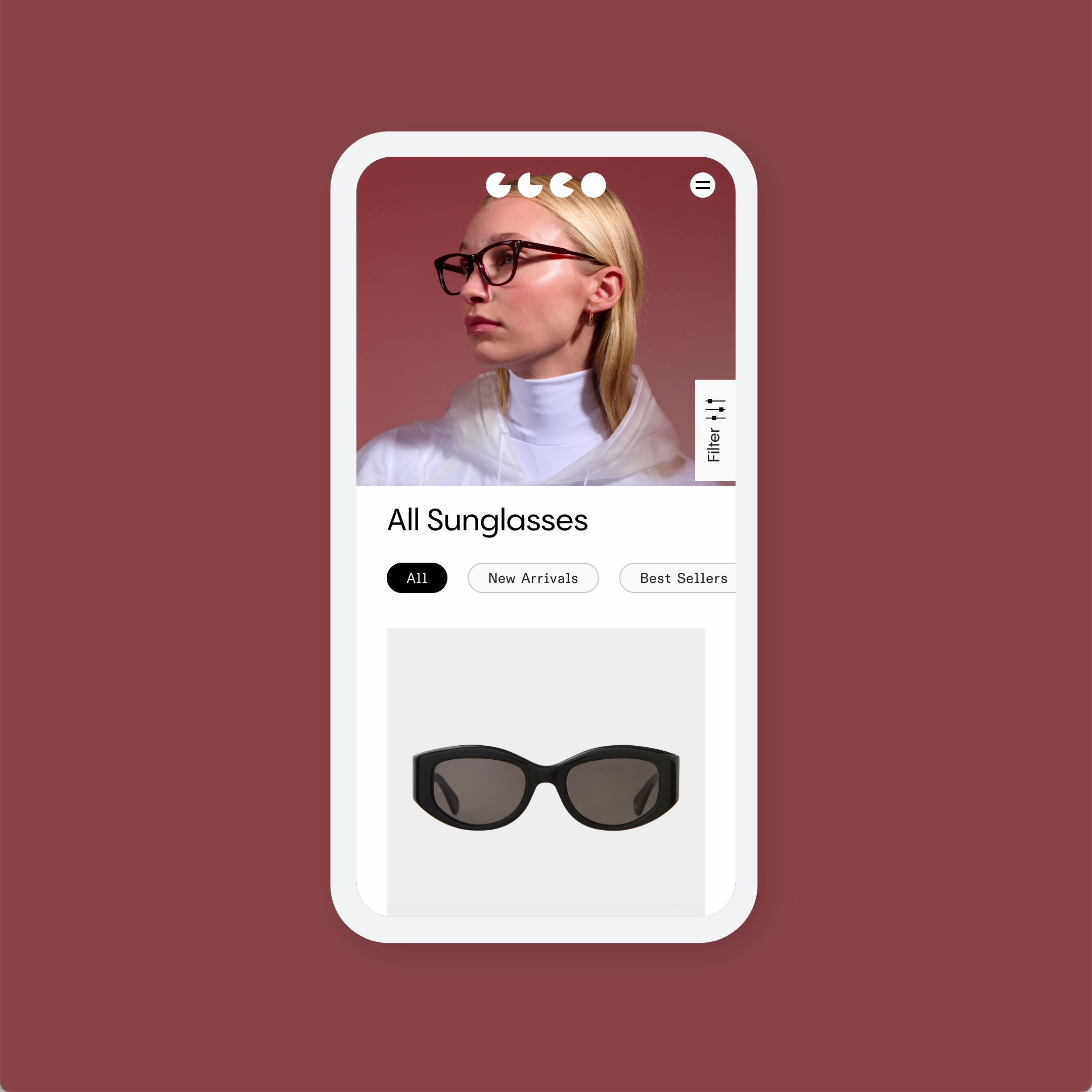
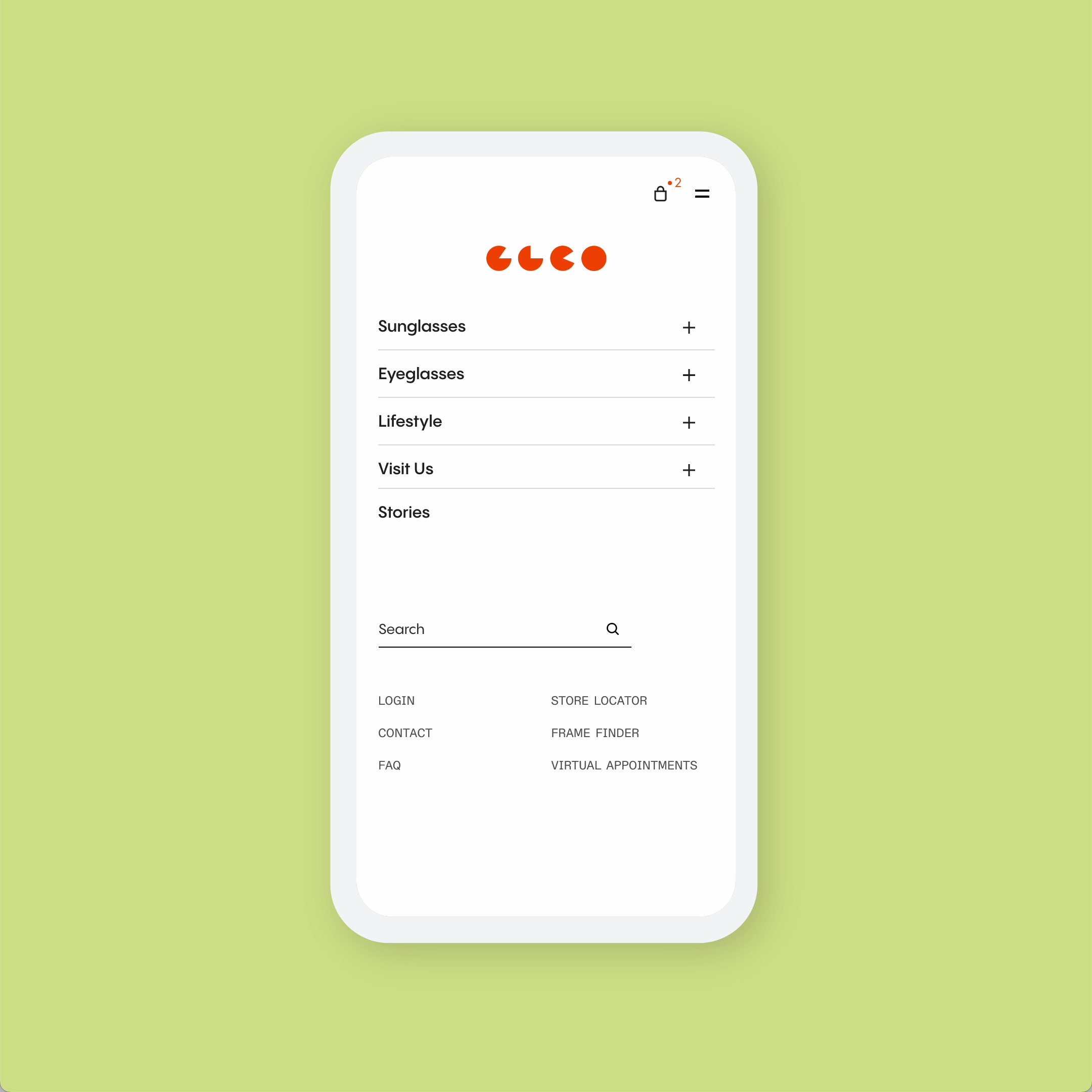
With the aim of streamlining the shopping experience for Garrett Leight’s customers, we outfitted their new site with navigation that cuts down on clicks, using sleek sliding tray navigation with robust filtering that makes finding the right frames quick and easy, especially on mobile.
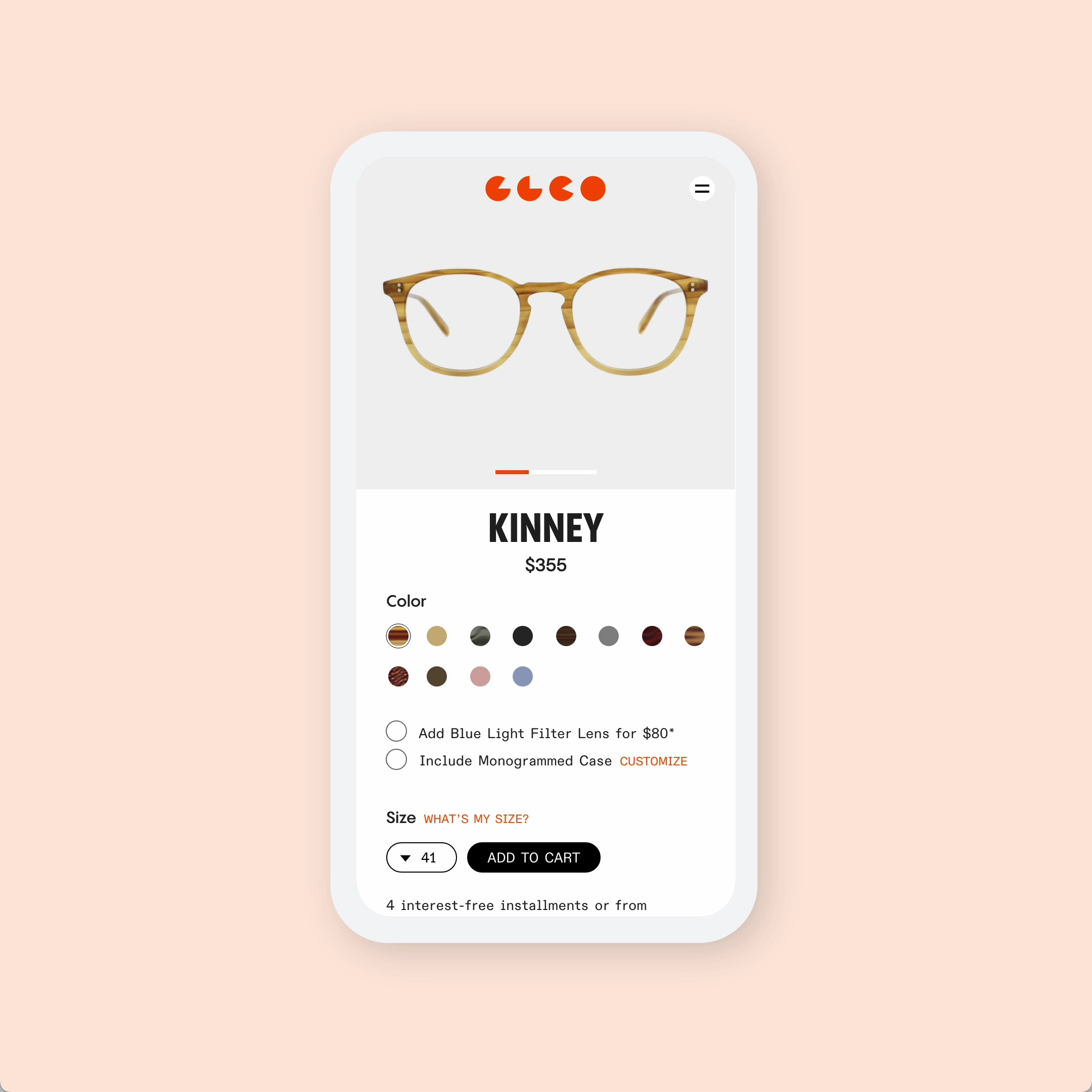
We also prioritized maximizing impact on product detail pages by placing large format product photography front and center on the page, allowing the user to get a feel for the product and access all the information they need before making a purchase. We made these pages easily scrollable, utilized a locking component at the bottom of the page, and kept design elements robust but simple overall, always placing the focus squarely back on the product.
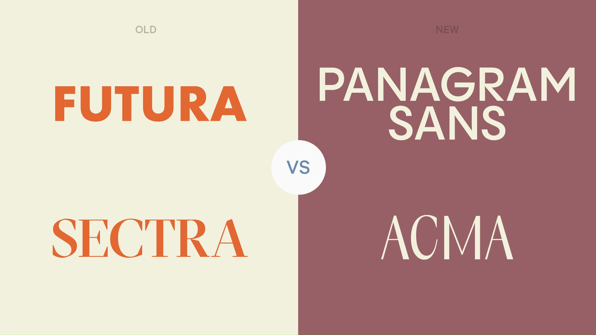
The brand previously used Futura, a timeless sans-serif font, as their foundational typeface, but they had expressed some issues with it. We pitched them on a more modern, evolved version, Panagram Sans, that is now the core typeface of the site. We also upgraded Mr. Leight to Acma, a typeface that embodied more feminine qualities and would appeal more towards their target audience of women between 25 and 45.

E-Commerce
An online retail space that complements the in-store experience
We designed everything from Garrett Leight’s new homepage to their product detail pages with the aim of capturing the spirit of their bespoke in-store experience and setting them apart from competitors online. Using Shopify Plus and following best practices around checkout, product presentation, and use of plugins, we stuck with what works with traditional e-commerce site design — keeping things simple but impeccably done to unify the brand and showcase the product. As a global brand, they also needed to accommodate international customers, which their separate website for the European market does with ease, using separate integrations and following the unique fulfillment protocols for that region.