NY-based post-production experts Harbor Picture Company selected their moniker to reflect that they are a place that offers a safe harbor from creative chaos. They came to Funkhaus to work on branding that communicated their grounding, collaborative, and aesthetically-minded identity, and website design that would adequately represent the different disciplines at Harbor, showing that they have a large swath of capabilities and placing the emphasis on their creativity and expertise.
Harbor Picture Company
A creative haven for an expansive production company
Harbor Picture Company A creative haven for an expansive production company
Strategy
Uniting a broad set of capabilities in one strong foundation
Harbor is a soup to nuts company, able to take a project from ideation to completion with a roster of directors, editors, and post-production specialists. The challenge with their digital representation was deciding how to tell the story of this expansive process under a singular umbrella, and how to create an experience that can cater to each one of their target audiences, whether they are looking for a broad picture or a deep dive on capabilities and work. Through the seamless integration of multiple verticals and the development of modular case studies, we were able to deliver a site that felt like a homecoming for each division of the company, with new and interesting information in each corner, waiting to be explored.
Website Design
Establishing an aesthetics-forward digital anchorpoint
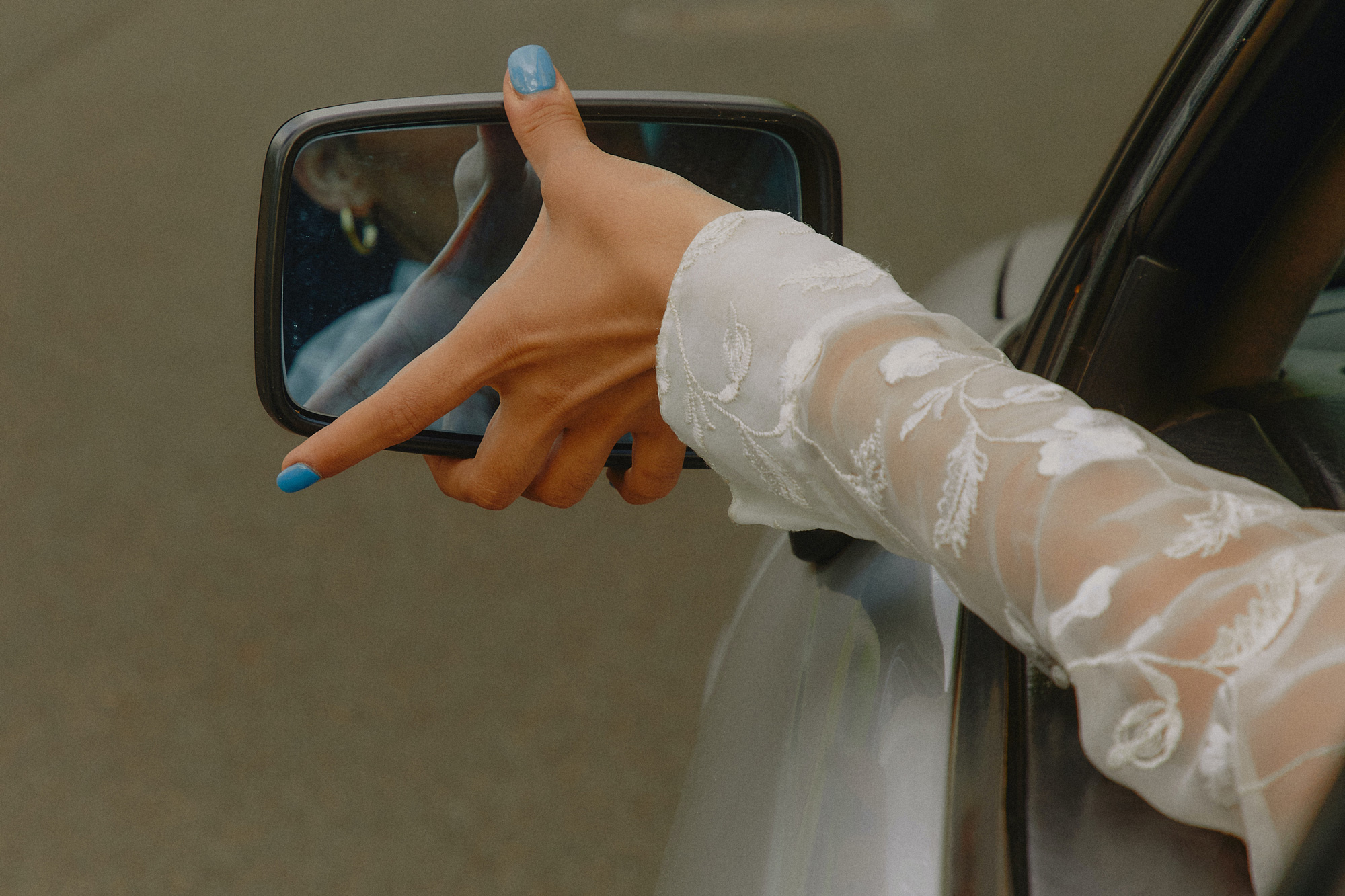
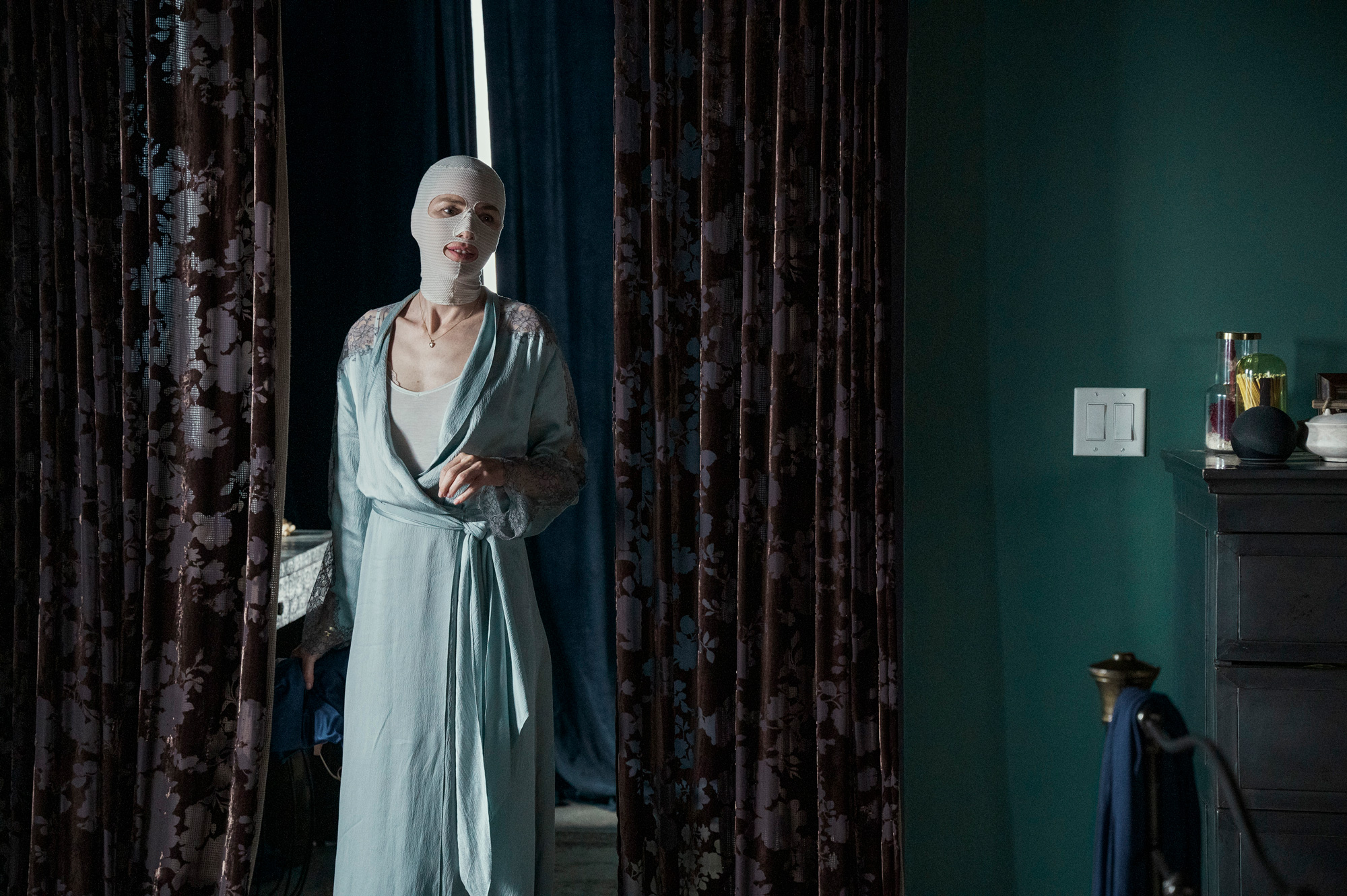
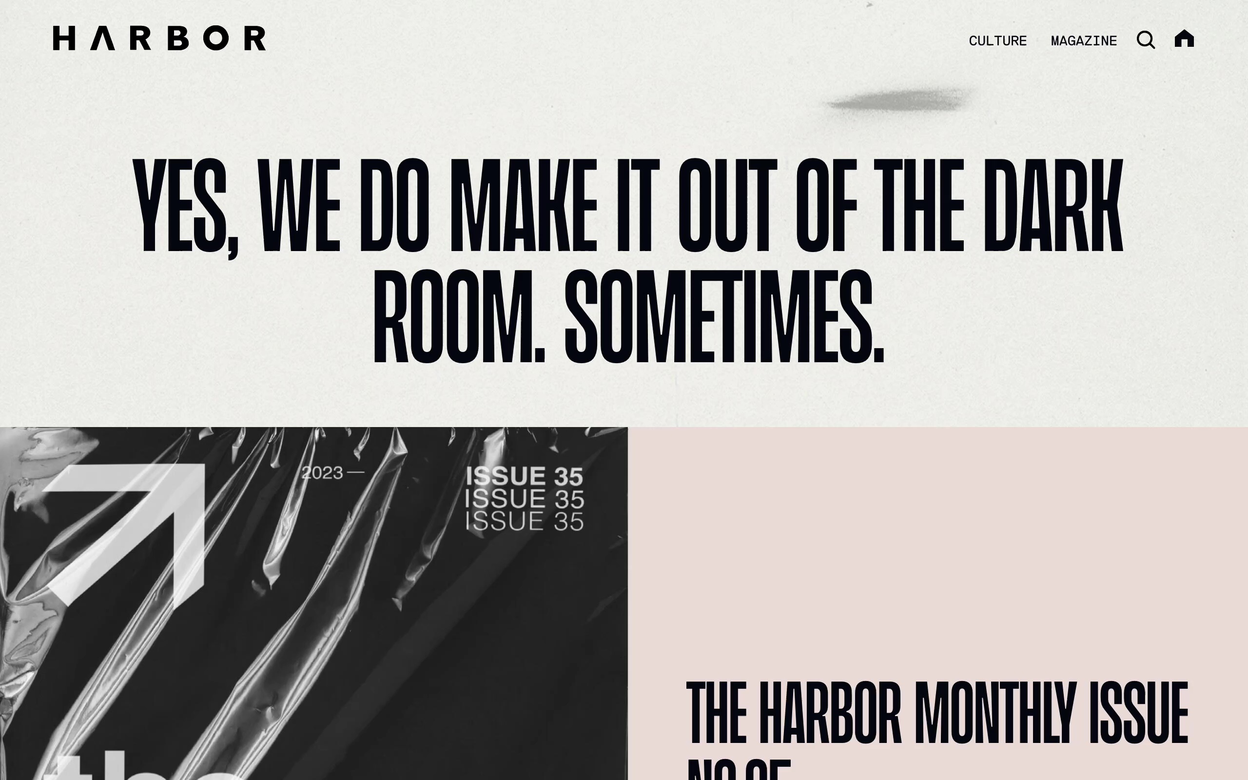
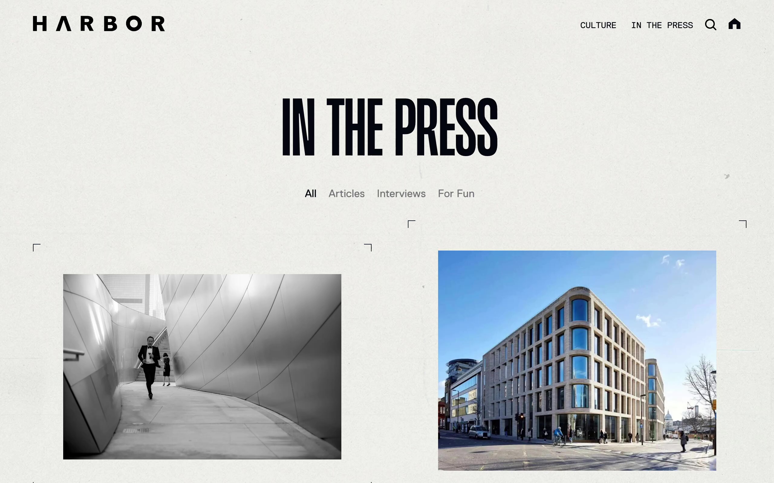
Harbor sets itself apart with the production of its own quarterly magazine, and with the knowledge that Harbor’s team invests energy into interesting venues for brand promotion, we wanted to pull from that existing format.
We found inspiration in that quarterly publication, as well as in magazine design layouts from the 90s and New York City style, guided by the ideas that the design should be something that could double as an advertisement you’d see on a city street. To capture that aesthetic, we played with skeuomorphic design — melding real textures and original design cues into this digital application and creating contrast between clean and gritty elements.
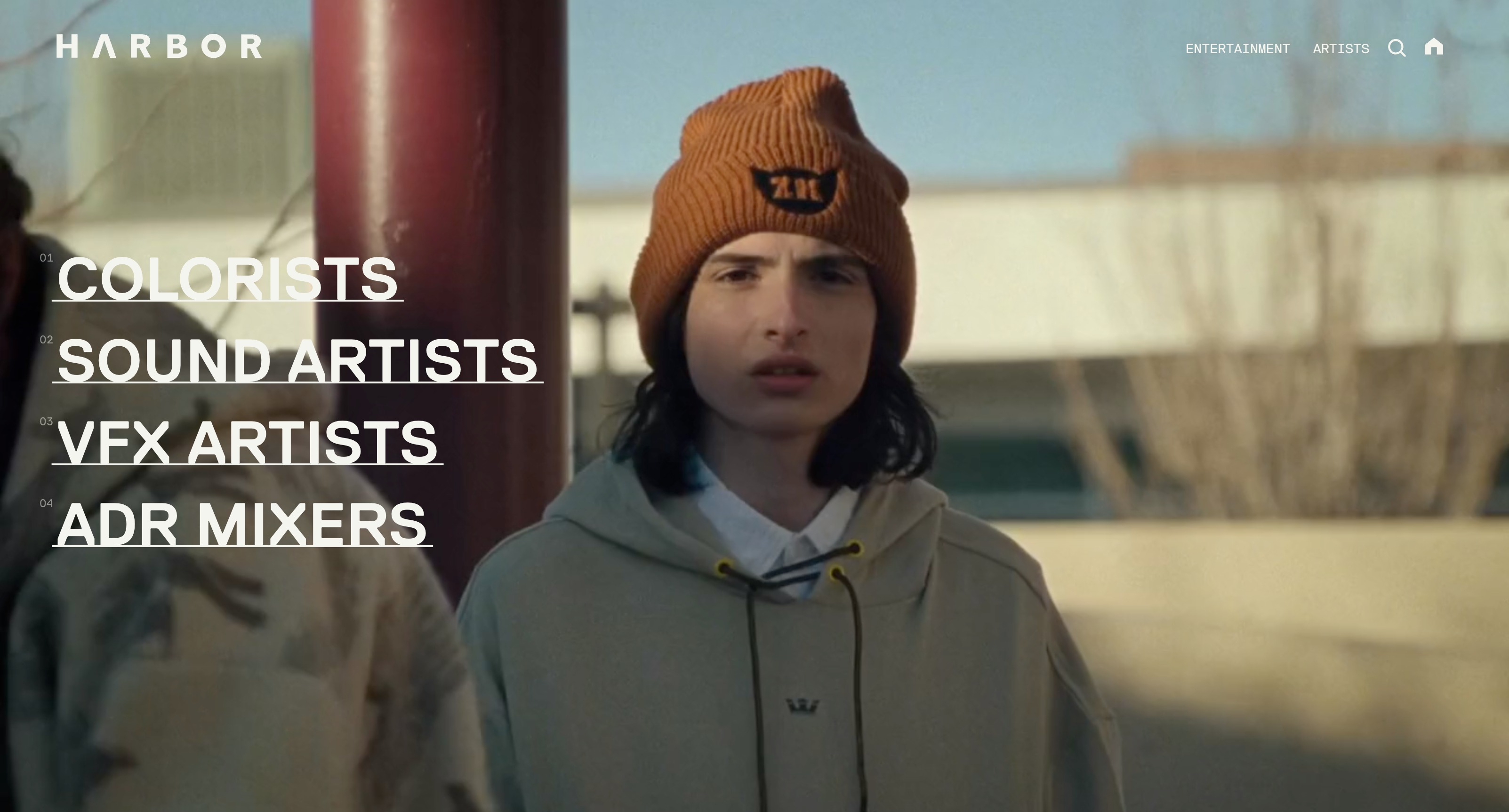
We selected one signature typeface, then subverted its usage to break convention and inject personality and edge back into the design. We were greatly inspired by the anti-design principles of Ray Gun Magazine, which we felt fit the sensibilities of Harbor perfectly. The resulting site is one that feels different from what you would expect of a company in this industry and leaves a lasting impression.